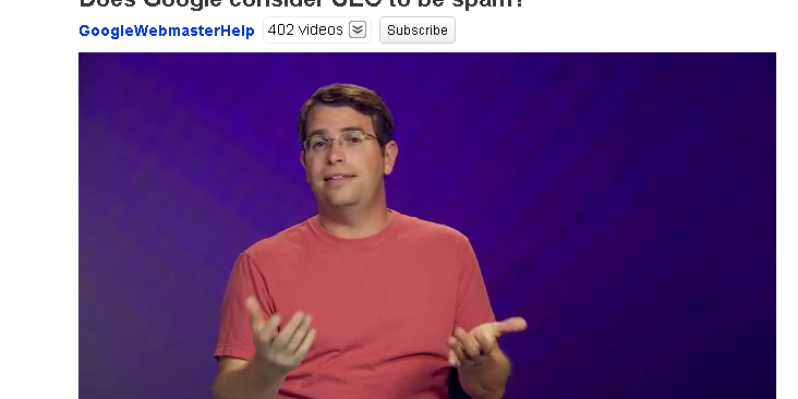
Below are the Top 4 Whitehat SEO methods as mentioned by Matt Cutts, Google’s CEO. He gave us a view into what Google considers to be “good” SEO but he didn’t really flesh out these concepts too thoroughly.
Recently Google CEO, Matt Cutts felt he needed to go on the record again and state that “Google does not consider SEO to be spam.” It is perfectly legitimate to try and make sure your pages are well represented in the search engines.
Below is the original video from YouTube and the 4 top tactics he mentioned in this video and what they mean for your website.
1. Make Sure Your Website Is Crawlable
This simply means making sure your site is accessible to the largest audience possible. The audience should include people and search engines alike. Some great ways of achieving an easily accessible website are:
- URL Structure: If all the urls in your site look something like—www.example.com/253738/sfgdghd/wteyeu chances are no one is sharing those links and the search engines can’t find those pages easily enough. Use plain text links formatted with CSS that are clear and easy to read something like: www.example.com/seotopics/seo-is-not-spam
- Navigation: Make sure you have a text version of your navigation somewhere on your site, so for instance if your main nav is images (not recommended) and a user with a low-speed connection wanted to view your site with images turned off, they would still be able to see a clear way around your site. It’s even a good idea to double up on links that are important i.e. Put your most important pages as text links in the footer of your site.
- Images: To the point of “turning off images” make sure you use alt text for all your images. This way if a user cannot or chooses not to load the images they can still get the point of what you are trying to show them.
2. Right Keywords
If you want people to understand who you are and what you want them to do, you need to make sure you are writing copy that converts. By this I mean copy that has the words that users were searching for, provides them the information they need and asks them to do something. Like “Downlaod Free MP3” whatever it is that you want them to do, make sure the words are clearly geared to them and not a bunch of industry jargin that no one but your competitors will understand. Hey, those competitors are not your customers right?
3. User-friendly
A user-friendly site is one that is designed with the user in mind. It is not flashy or showy and it clearly separates content from presentation. Our friends over at Just Creative Design have this to say about useability and I think it’s dead on:
“To design an accessible site, one of the most important things you can do is to separate content from presentation. Remember, people are visiting your site for the content. By separating the presentation from the content, you are giving your users the ability to use whatever client is appropriate to access your content, whether it is a screenreader, mobile device, or tablet PC.”– Chad Swaney , Just Creative Design
Content Layer should be organized as HTML with appropriate tags such as <h1>, <ul> and <div> tags. Images should have alt tags. Presentation Layer should not have fixed dimensions since we don’t know what screen size our user might be using, our design could break down in a smaller screen etc. Make sure your color and contrast are appropriate for people with bad vision. For instance, don’t make a whole website black with dark grey text or something crazy like that! Black on white or Black on light grey works just fine.
4. Site Speed
Many people don’t realize this but as Matt Cutts clearly states in the video- site speed is a factor that Google uses to rank your website. So how can we make our site run faster? A lot of what I discussed above will dramatically improve your site speed already but just to over-emphasize the point- make sure your content is separate from your presentation by using HTML and CSS for each respectively. Make sure your jpegs are optimized for web so that they load quickly. If you limit the technology the user encounters on the site, most likely your site will speed up. Lastly, While browser technologies such as Jquery and Javascript make a site dynamic and cool, make sure in your usability testing there is a way to turn these things off with no adverse effect on the content.
I hope these cleared up some of the ideas that Matt Cutts presented in the above video and you will be able to easily integrate them into your site design. As always if you have any questions feel free to email me at danielle@searchtrafficpro.com I do SEO, Austin!


Page title, contents, and link. Links, while being important, is overstated. You see that a lot of SEO masters managed to build massive amount of linkbacks, but without good amount of content, they probably don’t have the depth/variety of keywords.