Top 3 Web Design Mistakes for Local Businesses: Uncertain Location, NOT Designed for Conversions, Non-Responsive Design
Most local businesses have websites now. That’s a good thing. But the problem is many local businesses don’t have a good website.
In today’s video we cover the top 3 web design mistakes that local businesses commit.
Local businesses like law firms, senior living communities, financial advisors and the like often make some common web design mistakes even after spending thousands of dollars on a new website. That’s unfortunate.
So before you build your next website, here are the top 3 web design mistakes that local businesses commit on their website.
1. Uncertain Location
The web is worldwide (Remember www?). And people get that. The problem is many web designers haven’t figured out how to show every website visitor the services for a particular designated market area, or DMA. And you have to do that fast!
“There can be as much value in the blink of an eye as in months of rational analysis.”
― Malcolm Gladwell, Blink: The Power of Thinking without Thinking
You only have 5 seconds to capture the attention of each website visitor and show them they should stay on your website. If that visitor doesn’t think you serve their area, they’re gone forever. So tell them.
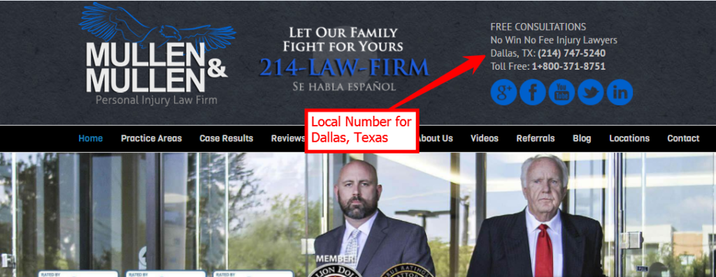
Use a local telephone number in the top left corner of the website. Use the name of the city with your exact service you provide. That way you will show prospects where you are and what you do in the first 5 seconds of the conversation.
2. Not Designed for Conversions
The second mistake web designers make when building a local business website is it’s not designed for conversions. For instance, you don’t have a hero message to tell people who you are and how you can serve your core audience also known as the unique selling proposition (see video #2).
Here are some ways to remedy this problem…
– Add a hero message to the home page of the website.
– Add a local phone number in a prominent place in the header.
– Give someone a compelling reason to contact you. Ex. Move-In Special
– Make contact forms as short as possible.
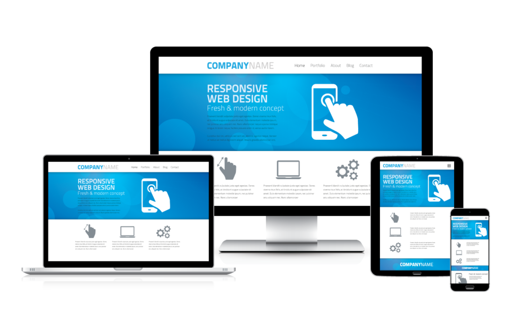
3. Non-Responsive Design
Did you know that more web traffic happens on mobile devices like smart phones and tablets than laptop or desktop computers?
In November 2016, StatCounter reported that 51.3% of all web visits happened on mobile devices and 48.7% happened on traditional computing platforms. That means that many or possibly most of your website visitors are coming to your website on a mobile device.
More than that, Google organic search is now dinging you on mobile searches if you don’t have a website that’s optimized for mobile traffic. So make sure you have mobile-friendly or responsive design on your local business website.
Was This Helpful?
Then make sure to subscribe. That will help you become a better marketer for your business one quick video at a time. Until next time, all the best!


Great thoughts. Thank you for sharing informative ideas regarding in this matter. It’s really interesting discussion. Keep posting .
Thanks, Alex – all the best!